Date Picker
The date picker control allows the selection of a date within a range of valid dates.
If the date is required but not set, or is not set within the range of valid dates the control displays with a red border.

The control uses the HTML 5 date input control and the behaviour of this control varies between browsers.
The date can be entered by typing within the control or using the up and down arrows on the keyboard and is displayed in the short date format configured for the operating system.
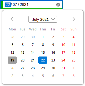
The control displayed in Mozilla Firefox.

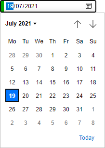
The control displayed in Microsoft Edge.

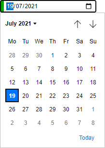
The control displayed in Google Chrome.

The control displayed in Internet Explorer, the date must be entered manually in the format year-month-date.
